
Last Updated on March 14, 2025 by Clark Omholt
We often get questions about the difference between additive and subtractive color. This article explains the differences between the two color models and provides some recommendations for your photographic and design workflow.
What Is Additive Color?
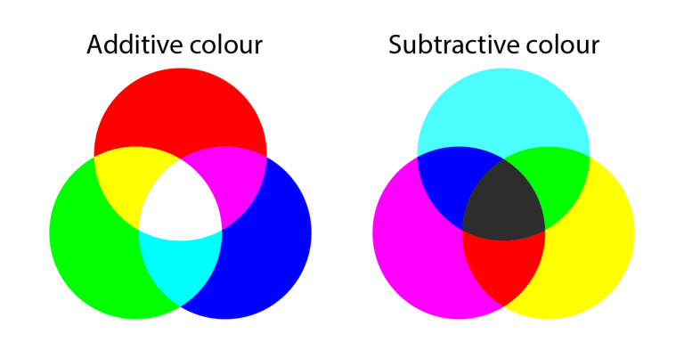
Additive color – like human vision or a computer monitor – starts with black in the default or OFF state and then “adds” color. With an 8-bit RGB monitor, if you add the maximum amount of the colorants (RGB = 255, 255, 255) it adds up to bright white.
What Is Subtractive Color?
By contrast, with a subtractive system – think painting on a canvas or printing on paper – you start with a white substrate. By adding colorants (CMYK for printing) you are “subtracting” from white. If you add the maximum amount of all colorants, you get to black.
Note about Printing
In theory, you can get to black using the maximum amount of the CMY, but since these colorants have contaminants (particularly Cyan), when you add maximum CMY you get a dark, muddy brown, not black. So black (K is for “key”) ink is used to achieve a proper black. And since a lot of printing involves printing black text, there’s a cost savings using just one color instead of three. Lastly, if you add some C, M, or Y to Black, this results in a “rich black”, which can often punch up a black.
I recall from my childhood that when you added blue and yellow together you got green. I thought this was pretty cool, that you could make all colors from a combination of just three “primaries”. Of course, when I learned about color, it was with paints – a subtractive system system. And when I mixed yellow with blue, I got a sort of forest green, not the bright green seen below from mixing yellow with cyan, which I never heard of until much later.
Which Color Model Should I Use?
In the practical life of a designer or photographer, you might ask “which color model should I use?” For photographers, there’s a compelling case to use RGB. First, all photographic imagery is captured in RGB, so you’re already in that mode. Secondly, when you’re retouching, it’s generally easier to think in a 3-variable system (RGB) than a 4-variable system (CMYK).
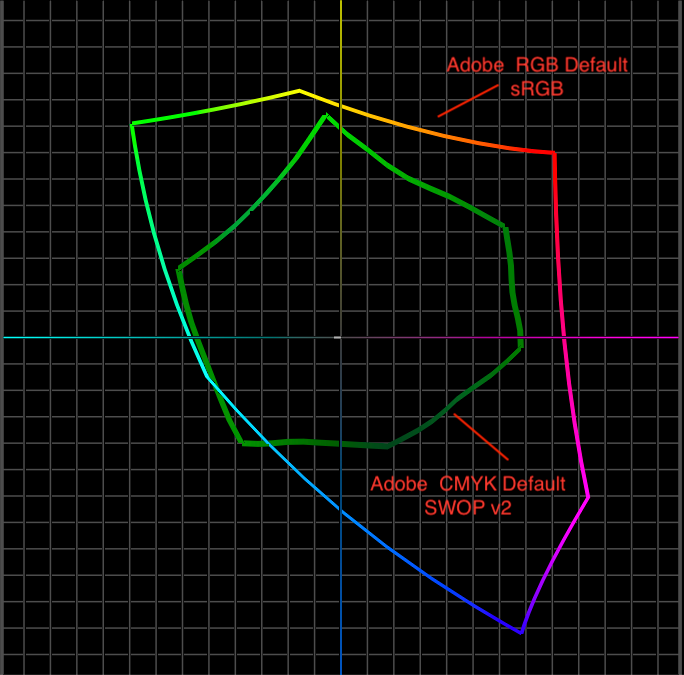
But what if you’re a printer designer, or if your final imagery is headed to print? I believe it is still better to work in RGB. That’s because the RGB color space is generally much larger than CMYK, so you get to work with a “bigger box of crayons”.
The screenshot below shows the default RGB and CMYK color spaces in the Adobe Creative Cloud. As you can see, the sRGB color space is much larger than SWOP v2, thus giving you a wider array of colors to work with. If you are interested in a deeper dive on RGB vs CMYK, see our blog entry.
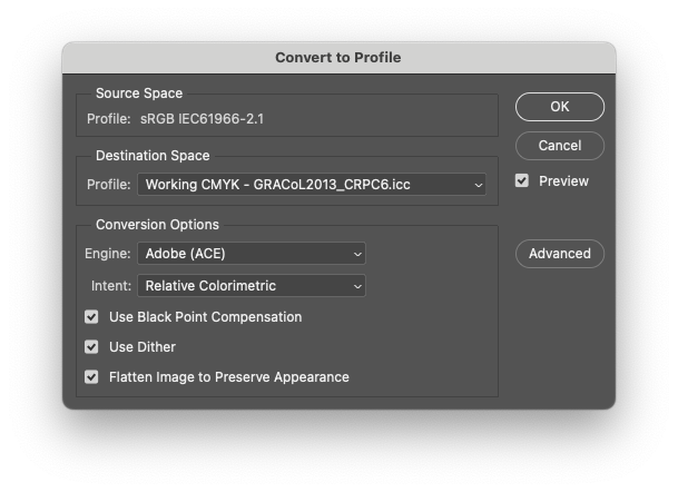
One argument for working in CMYK for a print-oriented workflow is your print provider will produce more reliable results if you provide them a CMYK file for their CMYK press. If they receive RGB, who knows how they are doing the conversion? This is a legitimate concern. But there is also an easy solution. Just convert to CMYK in Photoshop prior to sending to your print provider – Edit / Convert to Profile. I tend to use Gracol, which is a slightly larger CMYK space than SWOPv2, and is used by most offset printers in the U.S.
Summing Up
I hope my review of the topic has helped clear up some of the confusion around Additive vs Subtractive. For more color guides and topics, check back in with the TruHu blog. And for all your monitor calibration needs, be sure to check out TruHu, the monitor calibration app.