Last Updated on December 20, 2024 by Clark Omholt
Spot colors are commonly used in all kinds of printing applications. Spot colors have the potential to improve color fidelity and sometimes reduce cost. But working with spot colors can be tricky.
This article covers the definition of spot colors, some of the more common applications, and some of the tools frequently used to optimize spot color workflows.
What Are Spot Colors?
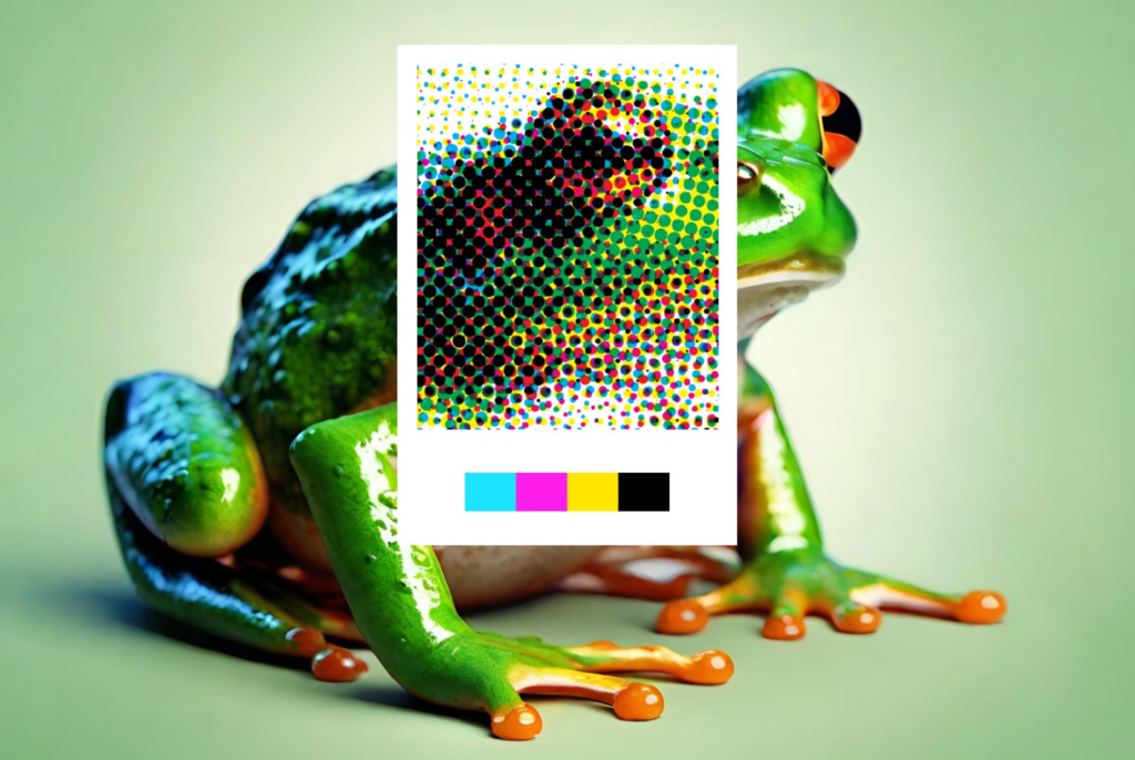
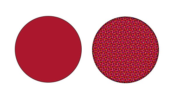
A typical printing press runs with four colors, CMYK, and this is sufficient for many printing applications. But often a designer wants to match a very specific color, think Coca Cola Red (Pantone Matching System 484). Even if the color is within the color gamut of a conventional printing press, since densities can vary throughout a press run, so can a given color built out of CMYK. And for brand colors, there may be very little tolerance for color variation. And in the instance where a chosen color is out of the gamut of a conventional press, the only way to reproduce the color will be to run an extra color, with a known formulation, on press.
These extra colors are known as Spot Colors. In the U.S., spot colors are typically specified as Pantone™ colors, known as PMS (Pantone Matching System) Coated or Uncoated for printing presses. Pantone also has a variety of other libraries, such as Cotton (TCX) and Polyester (TPG) for fabric, and others for Metallic, Leather, Paint, etc. Other popular spot color libraries are HKS (Europe) and DIC (Japan). Sometimes print specifiers or apparel designers will even define custom spot colors. While generally more costly, this will allow for unique color formulations that can drive brand awareness.
Applications for Spot Color Printing
1. Packaging
One of the most common applications for spot color is packaging, where brand colors predominate. In fact, it is not unusual for a package to consist entirely of spots colors.
2. Signage / Inkjet
As inkjet printers have proliferated and improved, so has their color gamut. For instance, a typical printing press might be able to achieve 50% of PMS coated colors. Meanwhile, a 12-color inkjet printing on glossy media can hit 90%+ of PMS colors.
3. Textile / Apparel
In the world of textiles and apparel, colors are typically specified as spot colors and delivered to production as indexed color.
An important difference between Print and Textile is Print is primarily a vector (Illustrator, PDF) workflow while Textile is primarily raster (Photoshop, TIFF). This has important implications for production.
How to Print with Spot Colors
1. On Press
Spot colors can be specified in your favorite graphics application When, for instance, a PDF is saved from Adobe Illustrator using the [Illustrator Default] preset, each spot color will be identified separately from the CMYK channels. Standards providers then provide a formula to achieve the desired spot color in production. Pantone, for instance, provides about 15 “base” colors from which all ~2700 PMS colors can be formulated. Of course, setting up an extra station on press involves extra cost, so using spot colors has to justify the additional cost.
2. Signage / Inkjet
No need for additional make-ready with digital printing. With the expanded gamut, inkjet would seem to be an ideal application for spot colors. However, matching colors on an inkjet, without a manufacturer-specified formula, can be tricky. This is where a RIP (raster image processor) comes in. Most production inkjet printers are being driven by a RIP, a sophisticated software that allows production benefits such as ganging of prints, color calibration for a wide variety of media, and (most important for this article), a lookup table of spot colors. In a vector workflow, spot colors can be identified and accurately reproduced based upon the device independent / L*a*b* values stored in the lookup tables in the RIP. Some of the more popular makers of RIP software include Fiery, Onyx, GMG, and Serendipity.
3. Textile / Apparel
There are a variety of ways to match spot colors in the apparel world – this includes traditional dyeing (cotton), dye sublimation (polyester), screen printing (T-shirts). In dyeing, a garment or thread will be dipped in a vat containing dye created using a formula specified by the Standard provider like Pantone.
Using Spot Colors in Process
Generally speaking, using spot colors on press will add to the cost of a job. The benefit, of course, is improved fidelity in color reproduction. But using spot colors doesn’t always have to add to the cost of a job.
Imagine a job has three graphic elements that calls for three spot colors (say Green, Purple, Rodamine) plus photographic imagery. If the imagery could be faithfully reproduced using just the three spot colors, then it could be run as a three-color instead of a seven-color job, a potentially significant savings.
But if your photographic imagery is in RGB, as is typically the case, how do you separate to the three spot colors? Most people are used to separating in Photoshop by using Mode/CMYK and – voila! – your image is ready to print. But there’s nothing in Photoshop that allows you to separate to Green, Purple, Rodamine.
This is where a suite of products from GMG, built around their OpenColor software can prove handy. Using OpenColor is reasonably complicated, but GMG’s key insight is to store the color information spectrally. This allows them to accurately predict the behavior of tricky elements like overprints or gradients. With OpenColor, it is possible to separate to a non standard printing condition, such as a tritone, and it is also possible to add spot channels to CMYK, creating a 5, 6, or even 7 color separation. This is referred to as multi-channel. This is quite useful for packaging, where designs often call on multiple spot colors in addition to CMYK elements.
GMG also offers solutions for accurate preview on screen and for inkjet proofing. This solution introduces a true approval process for multichannel work, meaning it’s possible to separate your file, see it on screen, proof it accurately, and make changes according to artistic vision. For more of a deep dive on this topic, please see our Color Matters podcast episode with Jodie Steen, dedicated to multi-channel printing.
Our clients rely on OpenColor to create accurate and predictable separations for printing outside of the typical CMYK color space. They love the results because they can see what the file will look like before it hits the press. The feedback from one recent client was ‘this was the easiest press check I’ve ever been on’. Considering it was a complex package with 7 channels and overprints, it’s gratifying to know that we were able to achieve accurate, predictable results that made the press check seamless.
– Jodie Steen, NY-based color management consultant and multi-channel specialist
Summary
Spot colors are an effective tool for allowing designers to achieve their color vision in production. Some of the more common applications for spot colors are Packaging, Signage / Inkjet Production, and Apparel/Textile. These applications all have different workflows and tools to ensure accurate proofing and reproduction of spot colors.
For inkjet printing, a very useful tool is the RIP, which will usually contain a library of spot colors for more faithful reproduction.
More recently, GMG has launched tools to enable using spot color in process. This includes, previewing results on screen, proofing, and separating to multi-channel environments.